There is a particular moment — it arrives without warning, always — when a painting tips. Before it, you are making decisions. After it, you are listening. The Tessera series began in that second kind of time.
I did not plan Tessera. I planned something else: a large, controlled composition with a strict palette of twenty colours. The reference photographs were pinned up. The palette was mixed. And then I picked up a brush and made a mark that had nothing to do with any of it.
The palette of twenty narrowed itself to seven. Not because I chose seven, but because the painting asked for them and refused the others.
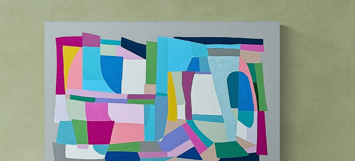
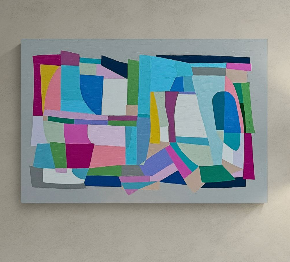
Tessera is the Latin word for the small tiles that make up a mosaic — the individual units from which a larger image emerges. I came to the name months after I had already made four paintings in the series, when I realised that this was what I had been doing all along: placing small, considered marks in proximity to one another, trusting that the image would hold together without me forcing it to.
The palette that chose itself
A studio practice has its own intelligence. Materials have preferences. Colours want certain neighbours and repel others. I have been painting long enough to know when to stop arguing with a colour that will not sit correctly, and when to let one take over that was not invited.
In Tessera No. 1 — a large-format piece built on a ground of burnt sienna and raw umber — the original composition included cobalt blue, cadmium yellow, and viridian. All three refused. The cobalt went too electric, the cadmium too sweet, the viridian too insistent. What remained, after scraping back and repainting three times, was a palette of warm terracottas, aged whites, and a single deep teal that appeared almost by accident in the lower left corner and became, eventually, the painting's centre of gravity.
A painting is finished before you think it is. The extra marks you make after that point are almost always the ones you will one day paint out.
On naming a series after the fact
I want to say something about titling, because it matters to me and I think it is often done poorly. A title is not a description. It is not a caption. It is a frame — and a frame changes what is inside it.
The Tessera works are abstract. They do not depict mosaics, or ancient tiles, or anything architectural. But the word tessera carries a particular quality of attention: the idea that a whole is built from small, individually considered units, and that the relationship between those units is where meaning lives. That is what I am doing in these paintings. Each mark is a tessera. The painting is the mosaic. The viewer's eye is what completes it.
What the series taught me
Four paintings into Tessera, I notice the following. I am working more slowly. I am mixing more. I am cleaning my brushes between each mark in a way I did not before, because cross-contamination — the trace of a previous colour drifting into the next — changes the character of the mark in ways that used to excite me and now feel like noise.
I am also working larger. The paintings are not monumental — they are human-scaled, made to live with a person in a room — but I have moved from 60 × 80 cm to 100 × 120 cm within this series, and I can feel the difference in my body when I work. A large canvas is a physical experience. You do not stand still. You move around it. Your relationship to the mark changes because your whole body is involved in placing it.
If you are interested in the available Tessera works, you will find them in the catalogue. Commissions within this series are currently open.